The font I designed for my logo is meant to be fractured, mainly for a unique look. It was created with creativity and standing out in mind, trying to stand out.
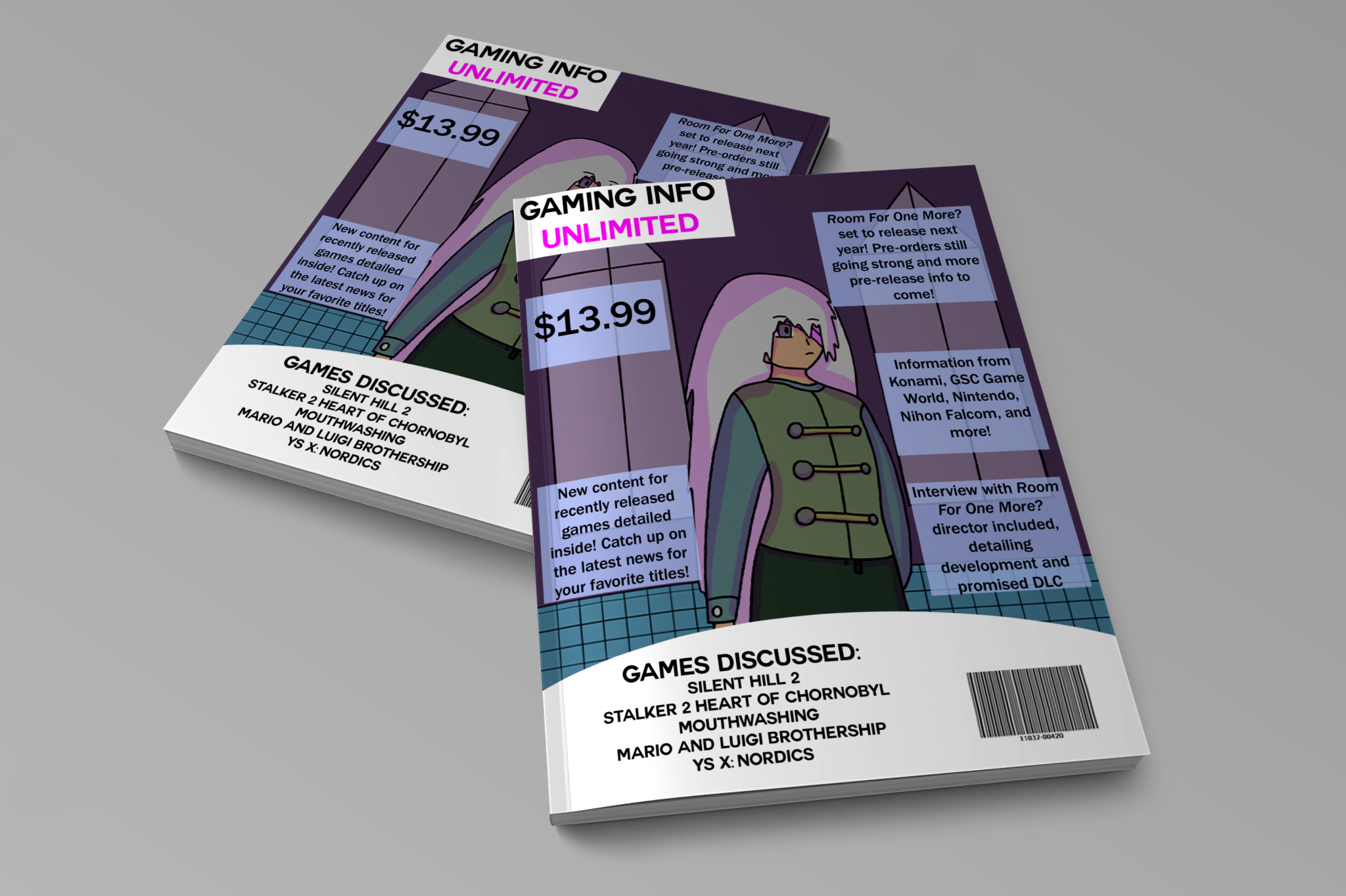
Magazine Concept
The goal was to emulate game magazines, making use of space, text boxes, and advertisements. Taking up as much room as possible was the target, as the reader would want to know as much as possible, alongside still getting to see the image.
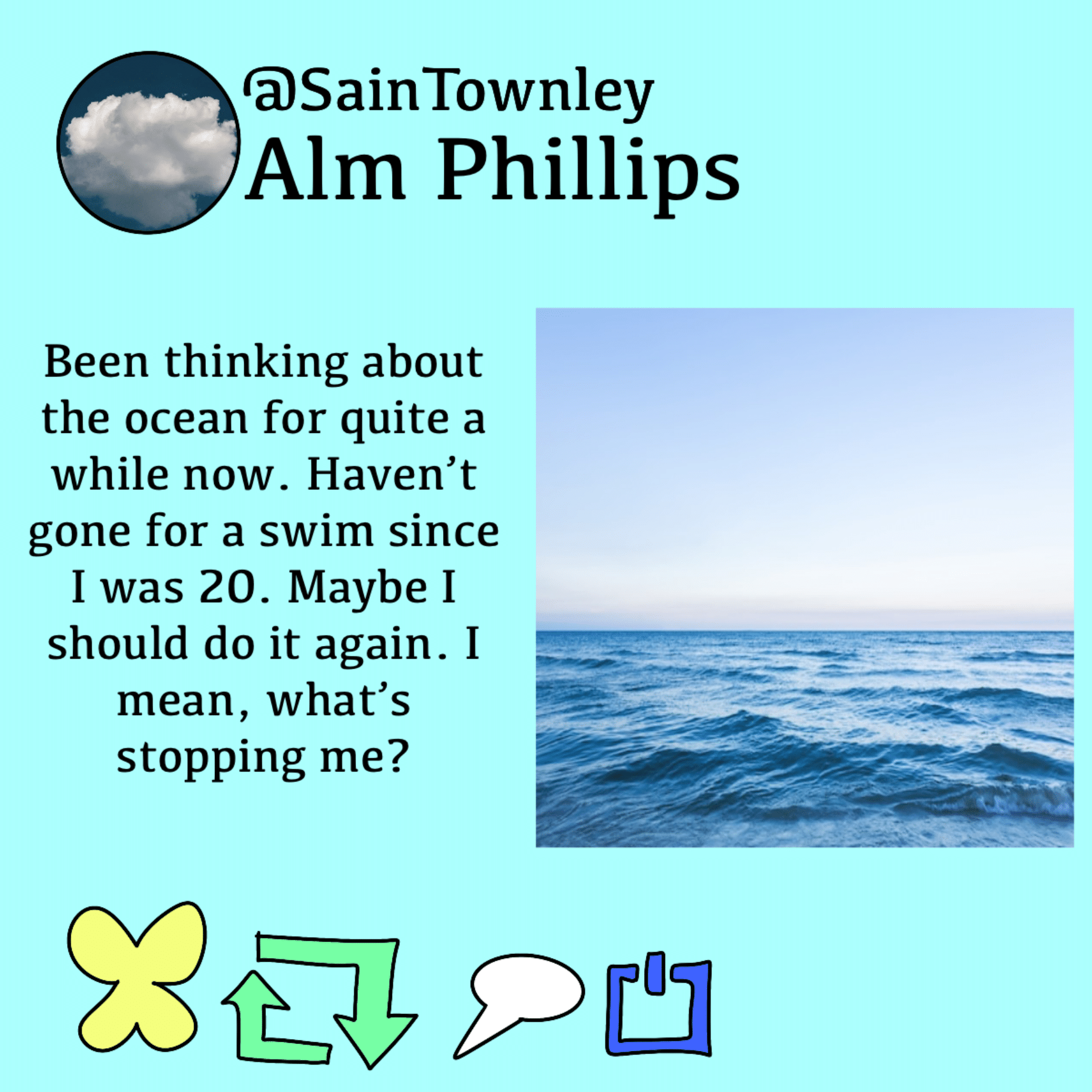
BlueSky Redesign Concept
The goal was to make an alternate design for BlueSky posts, which are very similar to Twitter (now X)’s posts. The format was meant to be more original, as well as replacing the red heart with a yellow butterfly.
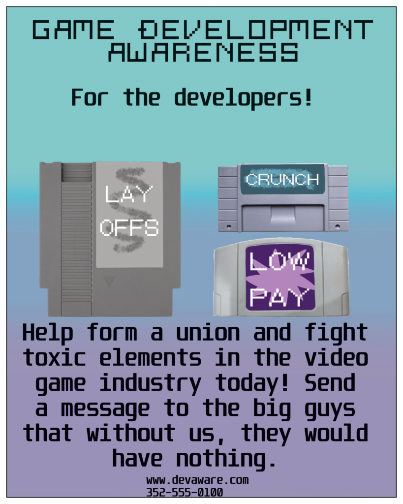
Social Awareness Poster
The goal was to create something that could spread awareness concerning issues in the game industry. Using fonts and imagery pertaining to video games, it can appeal to gamers and make them aware of the problems game developers face at work.
Website Logo
This logo is what I designed for my business, to give an idea of what I’m capable of. The neon feel to it represents my specialty in working with software and interest in tech.
Real Estate Video
This video was created for Blue Magnolia Real Estate, displaying their process details. It makes use of images moving to create animation, mainly to keep the viewer engaged.
Lip Syncing Animation
This video was created to display my own animation and art skills, mainly making use of dialogue and paying attention to lip syncing. I had to draw each mouth movement, which allows for a fluid experience.
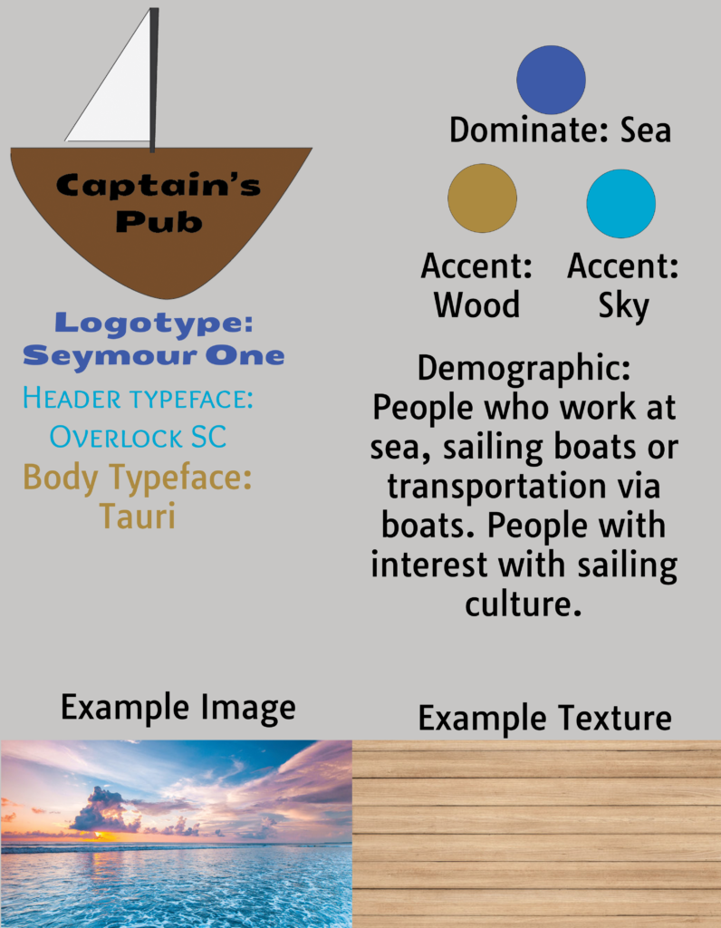
Branding Sheet
This was made for the formation of a website based around a hypothetical restaurant. It makes use of fonts, colors, and textures to establish the feel and aesthetic of the establishment.
Travel Page
A page for a hypothetical travel magazine, this one in particular advertising the city of Tokyo. It provides images of the city, and some information to tell the reader about it, all framed like a real travel magazine.
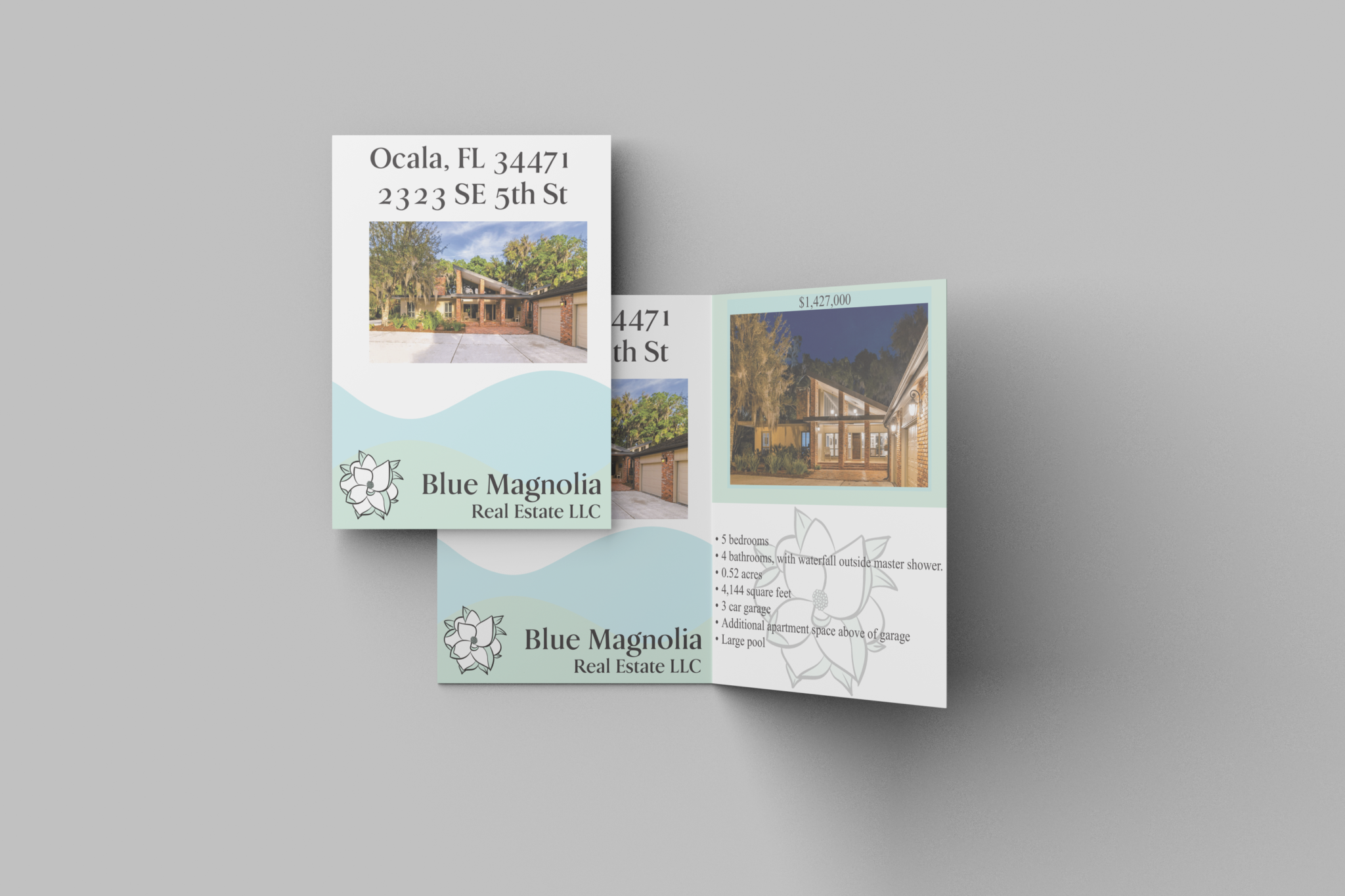
Blue Magnolia Real Estate Flyer
This flyer was made for a house Blue Magnolia Real Estate LLC is/was selling. It details what the house has, and uses the branding and aesthetic of the business to give the flyer personality.
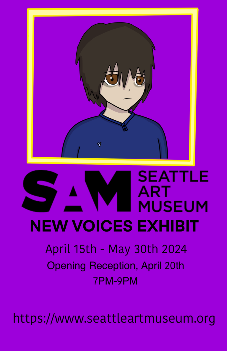
Seattle Art Museum Self-Portrait
For this, the goal was to create an advertisement for the Seattle Art Museum via making a self-portrait, and making use of other design elements to add to it. The frame and background colors are meant to add to the eye-catching appeal.
Cream Cheese Box Design
This box design was to create a hypothetical brand of cream cheese, made using Adobe Illustrator. It takes into note of nutritional facts as well as other details you’d find on a real cream cheese box.